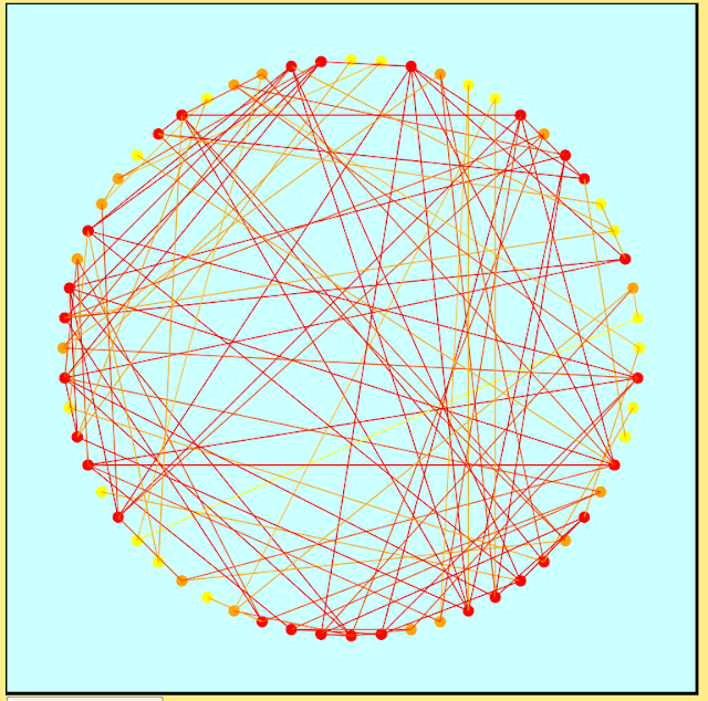
I've used d3 in the past for visualizing graph data, one example being the following circle-based graph layout. Rather than using the traditional black for nodes and edges I decided on a red, orange and yellow color scheme to focus attention to the denser regions of the graph and to reduce visual clutter. The nodes were colored according to degree on a scale ranging from yellow (low degree) to red (high degree). Edges were assigned linear combinations of their endpoints' colors.
So the first thing to note before you begin anything is the proper referencing of your d3 library. One option is downloading d3 onto your computer and referencing it, though one can also simply reference the library from online by using src= "http://d3js.org/d3.v3.min.js". There is also a d3.v3.js that one can reference, the difference between d3.v3 and d3.v3.min being that the latter is a more compressed version of the former which is good if speed is your concern. 
Rather than getting bogged down with all of the color and graph details, I'm going to illustrate some of the basics of d3 using a much simpler example: drawing a grid. The following code accomplishes the task, which I will then explain in subsequent paragraphs. Note that I'm including the surrounding HTMTL code as well.
____________________________________________________________________
<html>
<script src = "http://d3js.org/d3.v3.min.js"></script>
<body>
<script>
//create svg element and append to document
var width = 500;
var height = 500;
var svg = d3.select("body").append("svg").attr("width", width).attr("height", height);
//function for drawing an n by m grid within the svg container
function create_grid(n, m){
//first draw a rectangle in the svg
var rect = svg.append("rect").attr("width", width).attr("height", height)
.attr("fill", "white").attr("stroke", "black").attr("stroke-width", 3);
//draw n-1 horizontal lines and m-1 vertical lines
//calculate horizontal and vertical spacings between consecutive lines
horizontal_spacing = width/m
vertical_spacing = height/n
for (i = 1; i < n; i++){
svg.append("line").attr("x1",(vertical_spacing)*i).attr("y1", 0)
.attr("x2", (vertical_spacing)*i).attr("y2", height)
.attr("stroke", "black").attr("stroke-width", 2);
}
for (i = 1; i < m; i++){
svg.append("line").attr("x1", 0).attr("y1", (horizontal_spacing)*i).attr("x2", width)
.attr("y2", (horizontal_spacing)*i).attr("stroke", "black").attr("stroke-width", 2);
}
}
//create 10 by 10 grid
create_grid(10, 10);
</script>
</body>
</html>
____________________________________________________________________
Once you have referenced the d3 library you will then want to create your svg element. This will serve as the container element for all of the shapes that you subsequently draw (e.g. rectangles, lines and circles). To do this you will call the select method of d3 to select the body element to which you want to add your svg container. You will then want to append your element of type "svg", and then subsequently set all of the svg attributes such as height and width through the attr method.
var width = 500;
var height = 500;
var svg = d3.select("body").append("svg").attr("width", width).attr("height", height);
Moving along in the creation of what will ultimately be a grid drawing, I decided to create a function called create_grid(n, m) to which you can pass along arguments indicating the number of rows and columns of your grid. That way if you'd like to experiment with other grid sizes you can simply vary the parameters.
Regardless of your grid dimensions, the first step that you will subsequently want to take is to draw a rectangle within your svg container. Since we already created a variable reference to our svg element, we can simply call the append method onto that, specifying a shape type of "rect" for rectangle followed by the setting of its attribute values, which like the svg, also include things like width and height. Note that I also set attribute values for stroke, stroke-width, and fill. stroke and stroke-width are optional attributes indicating the color and line thickness for the border that is traced out by the rectangle. fill is also optional and is used to indicate the interior color of the rectangle. I chose white for my grid, but one can just as easily create red or pink rectangles by using "red" or "pink" in place of "white".
var rect = svg.append("rect").attr("width", width).attr("height", height)
.attr("fill", "white").attr("stroke", "black").attr("stroke-width", 3);
The remaining steps involve drawing the vertical and horizontal grid lines according to the specified dimensions. Given inputs of n and m for an n by m grid, this means that we will need to draw n-1 horizontal lines and m-1 vertical lines, which can be accomplished with the following two for loops. I used the horizontal and vertical spacing variables to adjust the spacing between adjacent vertical and horizontal lines respectively, given the fixed svg dimensions.
horizontal_spacing = width/m
vertical_spacing = height/n
for (i = 1; i < n; i++){
svg.append("line").attr("x1",(vertical_spacing)*i).attr("y1", 0)
.attr("x2", (vertical_spacing)*i).attr("y2", height)
.attr("stroke", "black").attr("stroke-width", 2);
}
for (i = 1; i < m; i++){
svg.append("line").attr("x1", 0).attr("y1", (horizontal_spacing)*i).attr("x2", width)
.attr("y2", (horizontal_spacing)*i).attr("stroke", "black").attr("stroke-width", 2);
}
The last and final step: calling the function to create and render the grid within the browser. I chose to create a 10 by 10 grid so my call to the function will be create_grid(10, 10). You will see a result like the following when you open the corresponding html file in a browser. I'm not sure if d3 will load in Google Chrome, and I'm pretty sure that it does not work in Internet Explorer, so to generate my grid drawing I used Firefox.

And there you have it! A few d3 and JavaScript basics. There are many more aspects to d3 that I haven't covered here, one of the most important being the binding of svg elements to data. Since I was working with a small simple example I thought it would be good to leave that stuff out till perhaps a future tutorial. For now just have fun playing around with the code and maybe trying to experiment with other shapes and colors. :-)

